Until a few days ago, arunbatchu.com was a list of posts. Now it's a world.
Let me explain.
The problem with lists
I've written 67 pieces — essays about AI agents and the changing shape of work, notes on books about owls, fungi, brains, and bees. A website shows them as a list. You scroll, you click, you read one, you leave.
But that's not how my writing actually lives in my head. The essay about walking while AI agents write my code is connected to the book note about how exercise builds brains. The piece about an agent that couldn't see certain mothers connects to a book about what plants know. A list hides all of that. It shows you items. It never shows you the shape.
An old dream
In the 1990s, an interface designer named Jef Raskin — he started the Macintosh project at Apple — had a radical idea. Get rid of pages entirely. Put everything on one infinite canvas, at a fixed place, like a landscape. Zoom out and you see everything you have. Zoom in and detail appears. He called it ZoomWorld.
Around the same time, Ben Shneiderman at the University of Maryland gave interface designers their most famous sentence: "Overview first, zoom and filter, then details on demand."
These ideas are almost thirty years old. They mostly never shipped. Building them was too hard, and the web settled on pages.
Then my AI coding agent and I built one in a day.
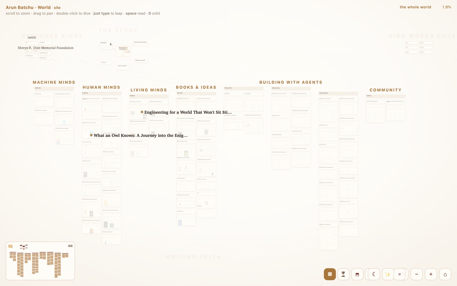
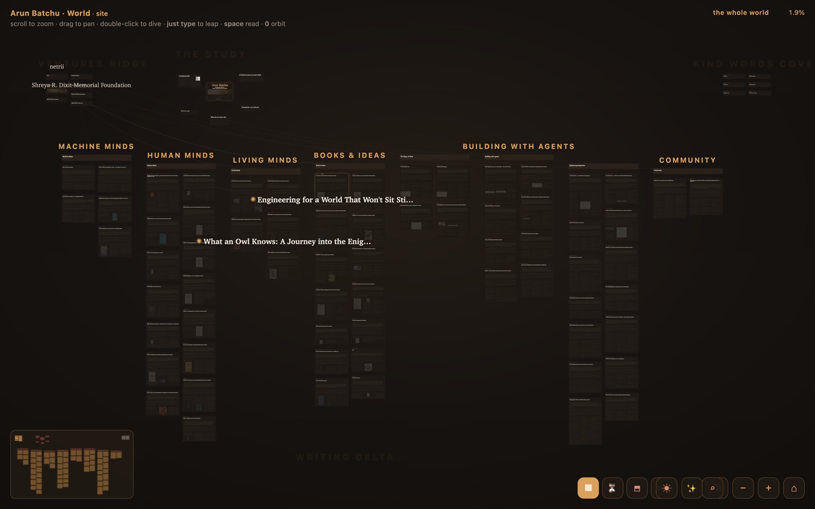
It works like a map of a real place
Everything I've ever published lives at a fixed spot on one canvas. My essays flow through a Writing Delta, sorted into basins — Machine Minds, Human Minds, Living Minds, The Shape of Work. My ventures stand on a ridge to the west. Kind words from colleagues collect in a cove to the east. Rivers connect things that feed each other: my bookstore pours into the book basins, my teaching flows into Machine Minds.
There's no menu. You scroll to zoom, drag to pan, and — my favorite part — you just start typing, and the world flies you to whatever matches. Raskin called that idea LEAP. Typing IS the command.
Then I noticed something while zooming around Google Maps: a good map shows you different information at different heights. Countries, then highways, then streets, then store hours. So we did that too. From high up, you see only the names of basins and my most important pieces — like city names on a map. Come closer and each basin tells you its stats: "5 pieces, 2024–2026, 18 minutes of reading, start with this one." Closer still, and each piece shows its neighbors.
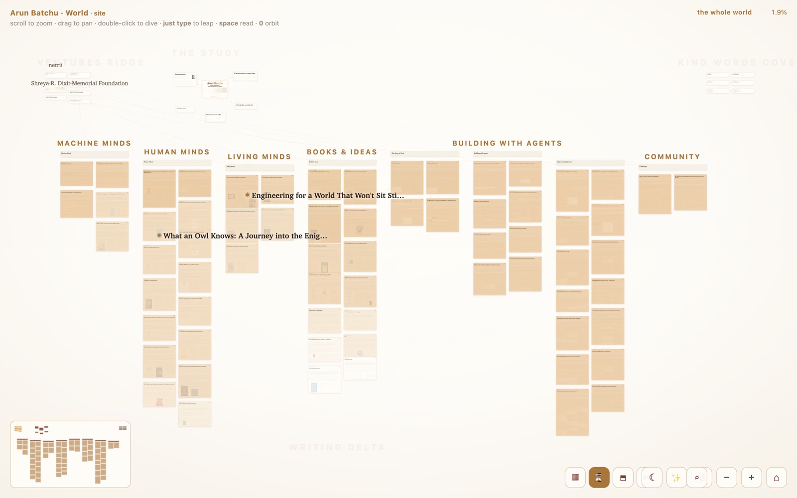
There's even a layers button, like satellite view. One layer tints every piece by age — my writing life as sediment, recent work glowing amber. Another shows every connection at once.
The part that needed 2026
Here's the thing Raskin couldn't build in 1995, because it needed large language models.
On a map, when you zoom out, a city doesn't get cut off mid-sentence — it becomes a dot. It gets summarized. But text on every website today only knows how to be truncated: "Here's the first 25 words and a Read More link."
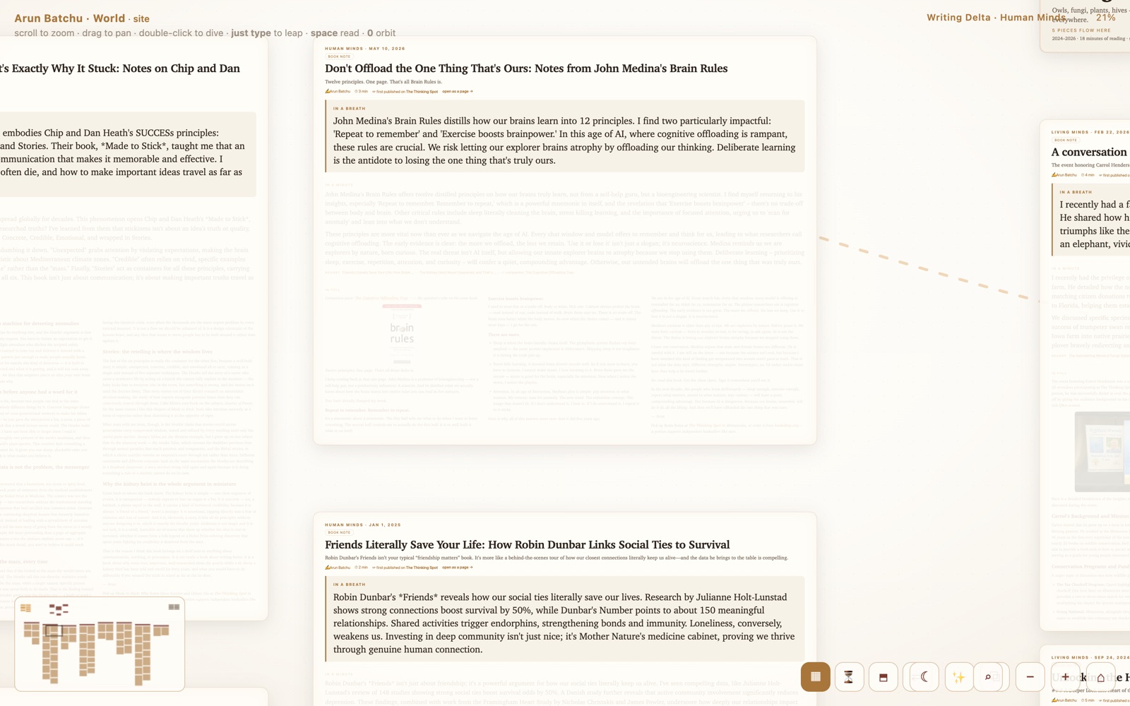
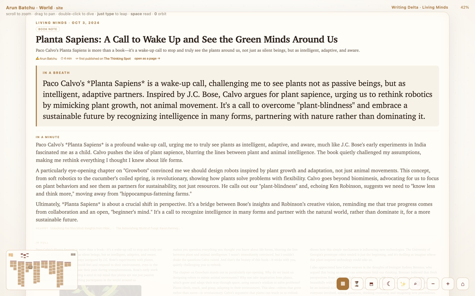
So we gave every piece four versions of itself, tied to altitude. From a distance: the title. Closer: "in a breath" — the whole argument in about 60 words. Closer still: "in a minute" — the piece in about 180 words. All the way in: the full text, laid out like a newspaper.
The summaries were generated by an LLM, in my voice, once, at build time — they cost nothing to serve. And the short versions display in bigger type, so each one is readable exactly at the height where it appears. Fewer words buy bigger letters. Zooming in is literally descending a ladder of abstraction.
What this took
One day. Not a team, not a quarter. One day.
I supplied the ideas, the taste, and the "no, that's not right yet." The summaries were unreadable at first — too small — and an owl book note was mysteriously ranked among my most important work. Claude, Anthropic's coding agent, did the building: it resurrected a zooming engine from an earlier experiment of mine, restyled it, generated the summaries, fixed what I flagged, and shipped each round to production while we talked.
I wrote an essay a while back called The Walking Engineer, about how AI agents broke the rule that building software means sitting at a keyboard. This project is that essay, demonstrated. The bottleneck was never typing. It was deciding what's worth building.
Go fly it
It's live: arunbatchu.com/world — works best on a laptop. Zoom out. Press a key. Watch it fly. It even has a night mode, because I read at night.
And here's the question I keep turning over: my website was just the first candidate. Every organization has a landscape like this — decisions, documents, expertise, lessons learned — currently trapped in lists and folders that show items but never shape. What would your knowledge look like as terrain?
With gratitude to the giants: Jef Raskin, Ben Shneiderman, and Ben Bederson, who drew the map to this thirty years early.